Hello again, everyone! For those of you in the States, I hope you had a Thanksgiving full of fun, family, and nearly embarrassing amounts of food.
This week’s edition of Phone Home features the home screen of Mark Reynolds, our second feature from across the pond! I was first made aware of Mark via Twitter, in a lengthy and hugely nerdy conversation he was having with fellow Phone Home participant Kyle Matteson. Since then I’ve followed him on Twitter, and really enjoyed his outlook on the tech world, especially via his ‘Technically Correct’ site and podcast. He’s highly opinionated, but I like that about him, and way more often than not I am in complete agreement with what he says. Thanks for sharing your homescreen, Mark!
– Kyle

You
What’s your deal?
I live and work in the north-east of England, not too far from the fine city of Newcastle… in other words: very far from London. You can almost think of north-east England as “Scotland lite.” I have a corporate stooge job selling a scientifically complex textile product, looking after and bringing in new clients but what I’d much rather be known for is The Technically Correct Podcast which I host with my good friends Simon Harris and Richard Bailey. I am almost amazed myself just how much fun I have making it and how proud I am of all three of us for creating what we do every week. We aren’t really a tech news podcast but rather three friends just riffing about whatever we fancy on a weekly basis provided it falls under the ‘technology’ umbrella or cracking stupid jokes.
Other than being obsessed with mobile technology I also love to travel (particularly to the USA), I’m a somewhat passionate beer geek and enjoy an awful lot of sports.
- The Technically Correct Podcast: Website & iTunes
- Personal Site
Your Phone:
- Model: Black iPhone 5 (so far I have resisted the urge to buy a 5S)
- HD Size: 32GB
- Wireless Carrier: 3
Your Apps
Do you have a philosophy behind the apps that you use, or the place/order that they exist on your phone?
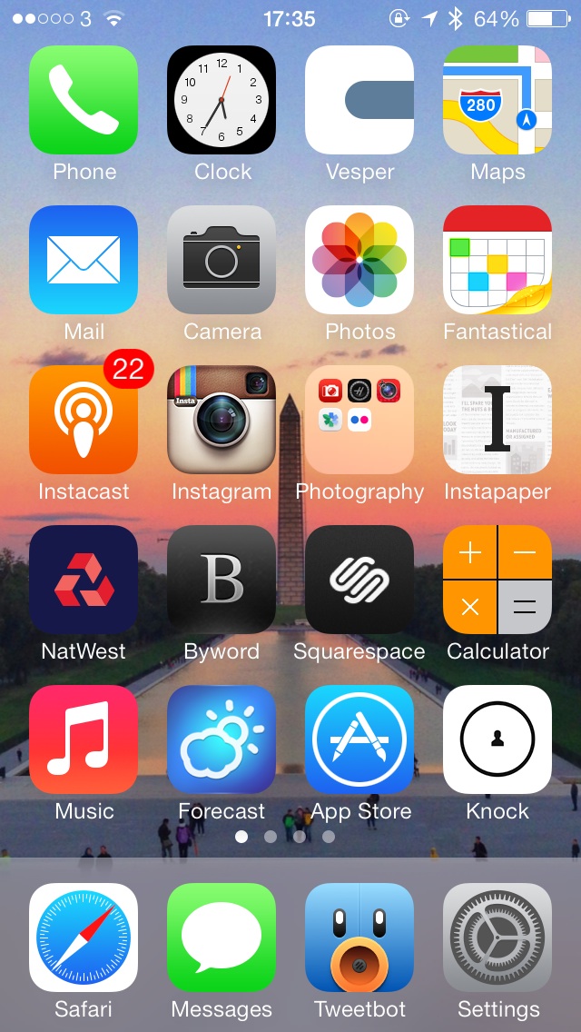
I do, in fact it’s a very distinct philosophy which probably requires a diagram so I made sure to include one! I think of my home screen as being divided into five discrete areas:
- The dock: This one is obvious and it’s where I store the four apps I either use the most or want quick access to from any screen.
- Top row: These are apps that I use frequently enough to warrant them being on my home screen but not so frequent enough that I find myself accessing them multiple times a day. I hold my phone pretty low down, I guess this behaviour is left behind from my days of owning iPhones with 3.5 inch screens, the result of this is that I have to stretch my thumb a little to reach the top row and so I don’t want my most used apps up there.
- Prime real-estate: This is the area of my screen most easily accessible from the natural position I hold my iPhone. I use this area for quick access, hence the cluster of photography apps. The other two apps, Byword and Squarespace, are my primary text editor and blog/podcast publishing app respectively. It still kills me that I have that folder there for extra photo apps, I absolutely hate having folders on my home screen and I cringe when I see people that have their home screen set up with a ton of them. No judgements, obviously you should use what works best for you but it’s not to my personal taste, sadly I have the one because I don’t see a way around it given that I want quick access to the apps in there. In case anyone is interested these apps are: Camera Noir, Hueless, Manga-Camera, Snapseed and Flickr.
- Left flank: being right-handed makes the left side of my phone is the next easiest place for my thumb to access and I put often used apps here.
- Right flank: other than the top row this area is the hardest work for my thumb to access and so apps that go here are used a lot but not as much as the ones that live in the left flank.
What app/s do you use the most? Are there any that you could not live without?
- Safari: I love Safari. It’s also my browser of choice on my Mac and with the inclusion of iCloud Keychain in iOS 7 it’s a no brainer choice for me. I’ve wanted to drop 1Password for a while and iCloud Keychain lets me do that in both iOS and OS X. I know a lot of nerds have been hopping on the Chrome for iOS train recently but I have a general distaste for Google, I often find myself cringing at their front-end design but it’s the way they make their money that really irks me about them so I avoid their products wherever I can. I take a lot of flak for this at times, I guess principles are old-fashioned.
- Tweetbot: I use twitter a ton and the official app just doesn’t contain sufficient features that power-users have come to rely on. I bought Tweetbot 1.0 on the day it launched on iPhone and it just keeps getting better. Tweetbot 3 for iOS 7 is a lovely refresh and in my opinion only Twitterrific comes close to rivalling it.
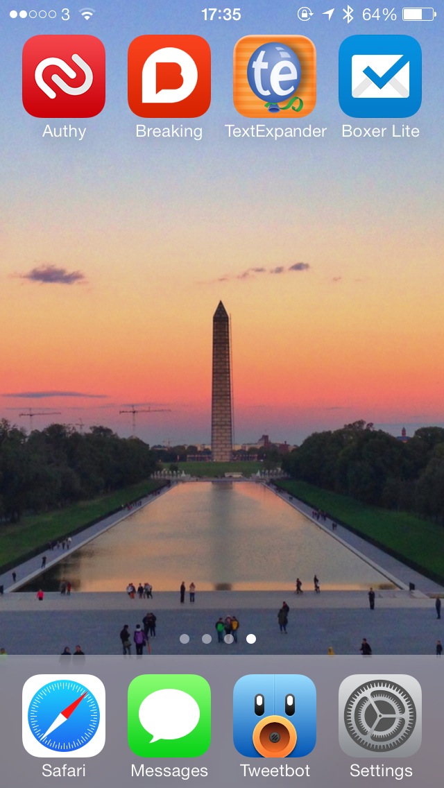
- Mail: I still haven’t found found a better email app for iOS and I’ve tried a lot, Mail is simple but it get’s the job done very well. I like the look of Mailbox but I don’t have a Gmail account so it’s useless to me sadly and I’m currently testing out the rather similar Boxer but I still don’t know how I feel about it.
- Instacast: Podcasts are awesome and I listen to a ton of them. Pocket Casts has been getting a lot of attention recently but I’m sticking with Instacast because of the companion Mac app, plus it seems like they finally solved the sync issues at some point in the past few months.
- Forecast: In the UK the weather tends to change at the drop of a hat, sometimes multiple times a day and so having an accurate and well designed weather app is key for me. Forecast is a web app, which still amazes me because it performs almost as well as a native app and it’s beautiful to boot.
- Knock: I got this app a few weeks ago. It uses a combination of WiFi, location and bluetooth low-energy to sense when you arrive in near proximity of your Mac. When you approach your Mac, Knock fires up and links to the companion Mac app allowing you to knock on your phone twice to quickly unlock your Mac.
Are there any apps that you use all the time, but secretly don’t want to admit to?
Instagram I suppose. Some look at it derisively with the fake filters and such but I’m a sucker for them even though they’re kind of ruining photography. Instagram typifies the kind of app I like though: it only does one thing and it does it well. It’s the best way to share photos with the world quickly and the fact that Facebook needed to buy them because of that only reinforces it.
How many apps do you have installed on your phone?
117 (I just had a huge clear-out recently)
Do you change your home screen layout often?
I try not to. When I do it’s usually a like-for-like swap, so for example Fantastical for Calendar. The other time I make changes is when travelling, I’ll often put Uber or Hailo on my home screen, along with OffMaps and some sort of guide for the city I’m visiting.
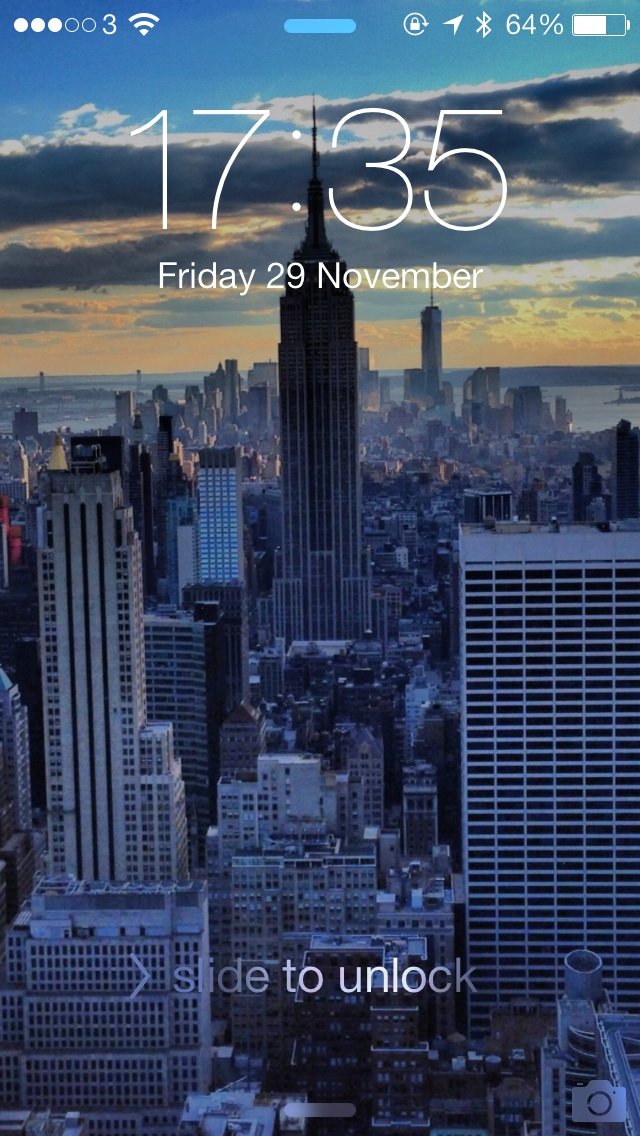 Tell me about your home screen wallpaper. How about the lock screen wallpaper?
Normally I have a fairly plain home screen wallpaper, either a dark, pretty pattern or a solid colour because I like the app icons to pop, but my current one of the Washington Monument is a little more ostentatious. I think it works though because it’s largely just comprised of a few colours in blocks. My lock screen is from my recent trip to NYC.
How are your other screens organized?
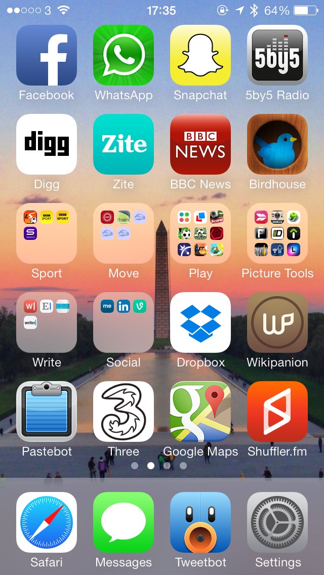
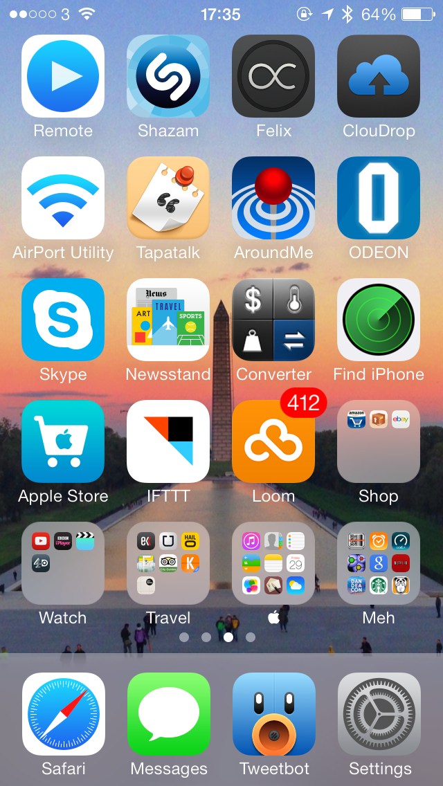
It ranges from OK to badly. Page two is reasonably organised with the top row following the same philosophy as on the home screen then I have three apps I use a lot for news: Digg, Zite and BBC News. Then there’s a bunch of self-explanatory folders and some reasonably oft-used apps at the bottom. Page three is a miss-mash and not particularly well organised and page four is where apps I’m testing out live.
